12.1. Window Editor
Okay. Before we dive deep into Window Editor, let's say, that there're still a few things which we need to tweak as this tool is very young. One of the things which can seem impractical is the absence of the default blank template when you add new window through Project Manager. This is an easy fix, so download this file: blank.zip and unpack it into your WME dev kit directory to the folder templates\window (so you have there now two folders - question and blank).
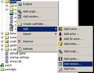
Okay. Now when we've done our homework, let's return to our task and add a new window in the project manager to the folder interface. Right click the folder and choose Add Window: 
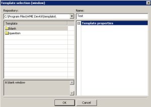
And select template blank plus name the window Test: 
Now see, that two files were added to the tree - Test.window and Test.script. It's actually the contents of the template folder, more on that in the templates chapter. Double click on the test.window to launch our new tool - Window Edit. 
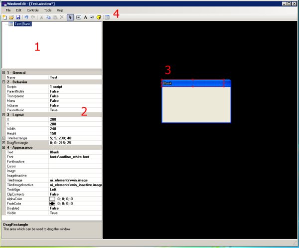
In the section 1 we can see the tree filled with components of our brand new window. As soon as we select one of the component, our property grid at the section 2 updates and we see the parameters which influence the selected component. Let's hilight now our Test (Blank) item and see what can we do to our window:
1. General
- Name - is the name of the window for further script referencing.
2. Behavior
- Scripts - every window can have scripts attached to it (similary to entities) which define window's behavior.
- ParentNotify - if you click inside the window you can set ParentNotify to true, which makes the parent container to get the input as well. This would be extremely useful for buttons for example, because you can have one script attached to window handling all buttons at one place. More about this later.
- Transparent - (true) means that window doesn't capture mouse clicks - they got through. If such a window contains some controls though, they can be clicked!
- Menu - (true) defines that the window hides if you click outside of the window.
- InGame - (true) means that the window is a part of the scene rather then stay on top. By default your inventory and other gui is painted the last which overlaps the scene, but you might need sometimes windows as a part of a scene (puzzles, etc.) and the behavior of them overlapping the inventory box for example is not wanted.
- PauseMusic - Before I'll explain this, let me tell you, that you can display your windows in three ways - normally, exclusively and system exclusively. Normally means, that the window is just displayed, but the game life goes on. Exclusive means that until the window is closed, it's the only object you can interact with and System Exclusive means that game is paused (all daemons etc.) and until you close the window, game is suspended. PauseMusic (true) means that the music will be also paused in the System Exclusive mode.
3. Layout
- X - X (horizontal) position on the screen.
- Y - Y (vertical) position on the screen.
- Width, Height - dimensions of the window.
- Title Rectangle - the area meant for displaying window caption (if any).
- Drag Rectangle - the area where you can drag your window for moving it around if needed.
4. Appearance
- Text - caption of the window.
- Font - font used for window texts.
- FontInactive - font used for the window when it's not active.
- Cursor - mouse cursor used when you hover the mouse over the window.
- Image - background image for the window.
- ImageInactive - background image for the window in inactive mode.
- TiledImage - special image coupled with a definition file. See chapter need to supply the number for explanation of tiled images.
- TiledImageInactive - the same but for inactive window.
- TextAlign - general text align for the window.
- ClipContents - (true) is very useful for example for windows with scrolling texts. You can simply scroll the text and it's clipped by the window size so you see the scrolling only inside of the window - box.
- AlphaColor - Okay. This will take some explaining thanks to our friends in Microsoft™ who messed it up a bit. Basically you can set here either RGB (red, green, blue) values of the color tint of the window. So you can make red window by putting there 255; 0; 0 or you can optionally set transparency level for such window by specifying alpha value (where normally 0 is fully transparent - invisible and 255 is solid so you can choose in between). But in case of this you have to provide not RGBA but ARGB and moreover the alpha value is only in the range of 0-254. If you set 255 here, it's percieved only as RGB. so If you need half-transparent green window, you set here 128; 0; 255; 0 (alpha 128 means half, red 0, green full and blue 0) and for solid window 254; 0; 255; 0. The logic behind this is that for fully transparent color you don't need alpha channel. So remember - it's ARGB where alpha is in the range of [0-254] and you're ok.
- FadeColor - is a color tint respecting the same logic as the AlphaColor and it's applied to the background behind the window. So you can make for example upon opening the menu everything greyish to indicate that the menu is exclusive or system exclusive.
- Disabled - means that the control is disabled so even if this window contains controls, they can't be clicked.
- Visible - means that the control is visible or invisible. It's sometimes good idea to have windows loaded in memory and only set their visibility to true or false when needed. For example if you have special decoration window for talking, it's a necessity as opposed to loading / destroying it all the time.
Okay. Time for spicing out our little window a little bit: 
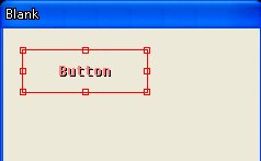
Click on the Add Button icon in the section 4 and then click-drag the button on the window to adjust its size. You should get the following result: 
If we have this newly created button hilighted, our property grid changed and we can easily see, that we can set some extra parameters to it (I'm mentioning only those which weren't already mentioned above):
Pressed - means that the button's default state is pressed down.
CenterImage - means that you can assign the image to the button and then center it in the buttons region.
PixelPerfect - is the same as with the sprite. If it's true, the mouseclick is accepted only on the active parts of the image (non transparent).
Focusable - means that it's possible to set focus to the button.
WORK IN PROGRESS…
